

Art.com Rebrand
Art.com may be the largest reseller of art, but it’s a twenty-year-old company, and it showed. My team stepped in, under creative director Kelly Niland, to update the old Art.com aesthetic.

The original logo was dated and corporate in a way that failed to inspire or communicate the Art.com mission. We sought to modernize the brand logo by downplaying the “.com” aspect, while modernizing the logo into something friendly and relevant.
In order to appeal to a broad audience with an even broader taste in art, it was important to have a logo that could work with any kind of artwork, or interior style.


We chose a circular shape and a small color palette that would work with a range of different art. This allowed versatility in design, as well as training the customer to see the Art.com brand as bright and colorful instead of being limited by black and white.
Typography
Two large font families allow versatility in order speak to various styles and subjects.


Corporate Identity


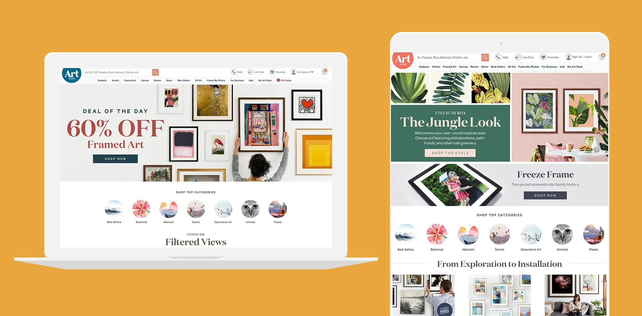
Home Page
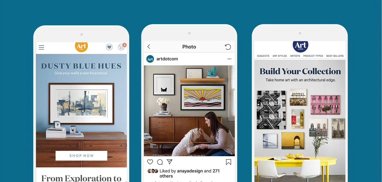
Email, Social and Mobile
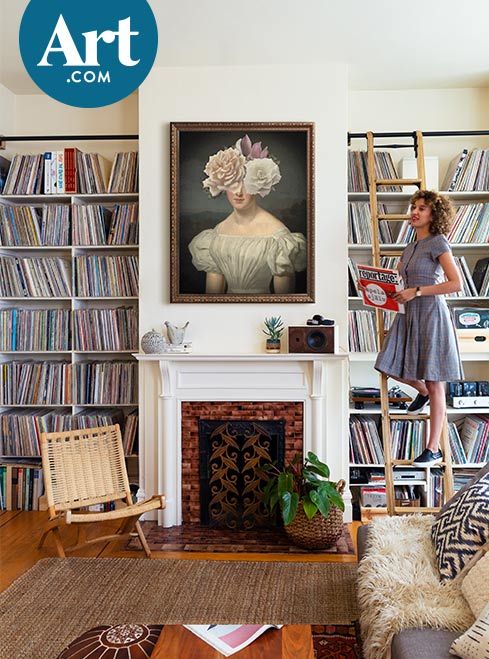
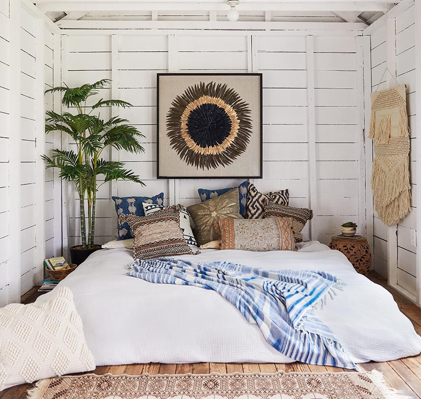
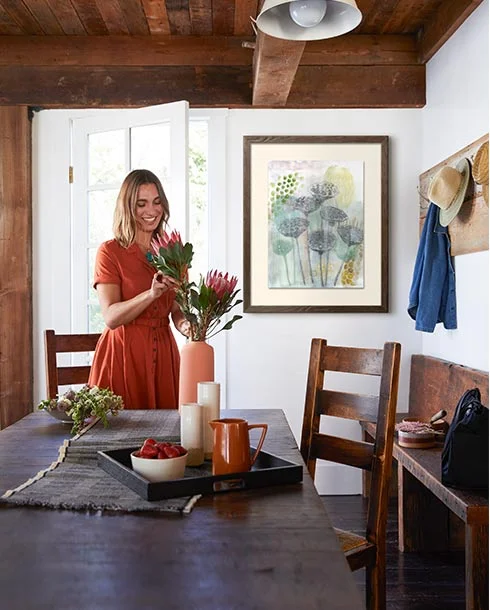
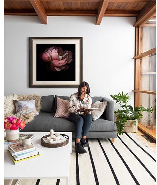
Photography
Our photography is meant to inspire and portray believable moments of everyday life with a current polished feel. We picture homes not staged— and that are aspirational yet attainable. We show people engaged in their space. The perfect shot is one that causes someone to imagine their life is better with art.
Photography Credit: Sean Dagen


Catalog

